 |  |
Images from February 2009 World of Interiors
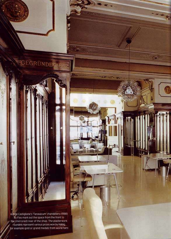
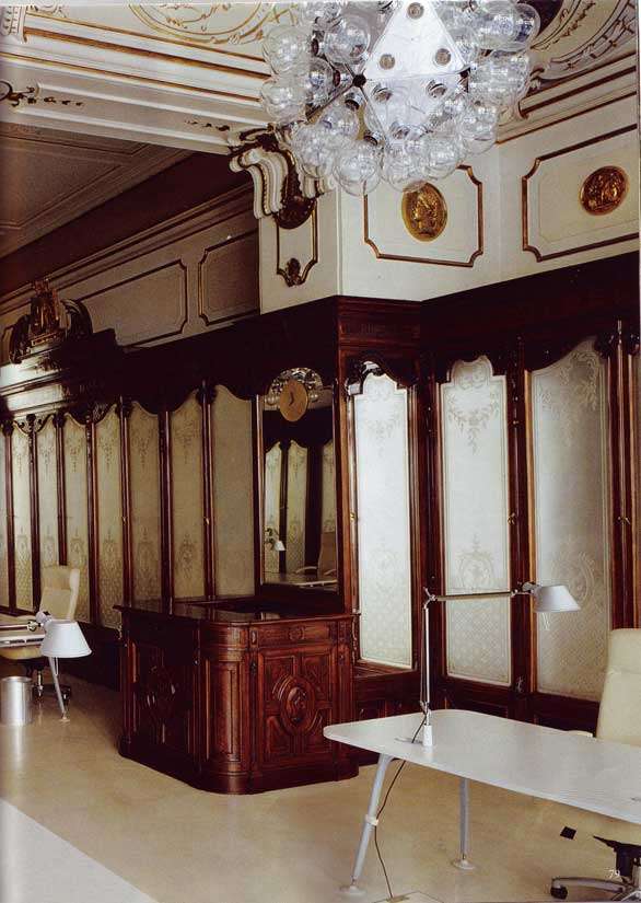
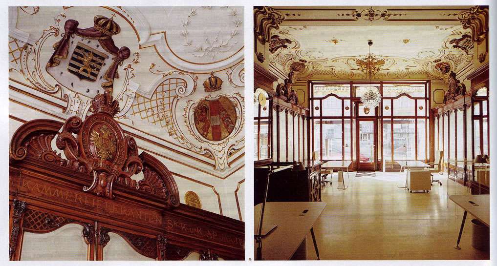
Right after I made my last post about boiserie, I happened upon this example in February's World of Interiors. The building was formerly the P&C Habig hat shop in Vienna, designed by Holzmann and Adam in 1896. Seriously, what's not to love?
- Red and blue crests are reminiscent of Fabergé jewels. They look delectable; I want to eat them.
- Ditto for the porcelain white walls paired with the worn antique gold latticework. My mouth is watering as I type this. Ideally, this is what a cake should look like.
- I. Love. Hats. I also love the idea that at one point in time, people felt that hats were of great enough import to warrant such a grand space.
- And what about the contrast between the ornate Beaux Arts style and the weird "Taraxacum" chandeliers by Flos? I think what makes the effect is that they vaguely replicate the light refracting effects of a traditional chandelier.


No comments:
Post a Comment