8.31.2009
Oh What I Would If I Could...
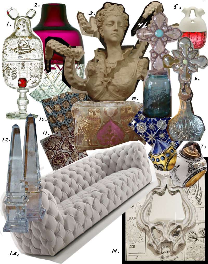
1. "Bonbon Treasure," from the Crystal Candy Set by Jamie Hayon for Baccarat. Limited edition, 1 of 25. www.hayonstudio.com, www.baccarat.com
2. "Blackberry Freeze" in clear and amethyst crystal, from the Crystal Candy Set by Jamie Hayon for Baccarat. Limited edition, 1 of 25. www.hayonstudio.com, www.baccarat.com
3. Medusa Bust work in progress by Philadelphia based artist Adam Wallacavage.
4. Turquoise vintage cross bottle by Claire Montrose. Available online at Greyfreth.
5, "Nuclear Pomegranate" from the Crystal Candy Set by Jamie Hayon for Baccarat. Limited edition, 1 of 25. www.hayonstudio.com, www.baccarat.com
6. Clear vintage cross bottle by Claire Montrose. Available online at Greyfreth.
7. Rings by Turkish jeweler Sevan Bickaki . Available at Barneys.
8-11. Hand blocked textiles by Venetian designer Mirella Spinella.
12. Rock crystal obelisks. C. Mariani Antiques.
13. Baxter "Chester Moon" sofa.
14. "Miroir Fait Mur" mirror by Galerie Maison Darré.
Labels:
Adam Wallacavage,
art,
Baccarat,
chesterfield sofa,
cross bottles,
Crystal Candy Set,
Fortuny,
interiors,
Jamie Hayon,
maison darre,
Mirella Spinella,
products,
surrealist design,
whimsical design
8.30.2009
Plush Purple, Transformed!
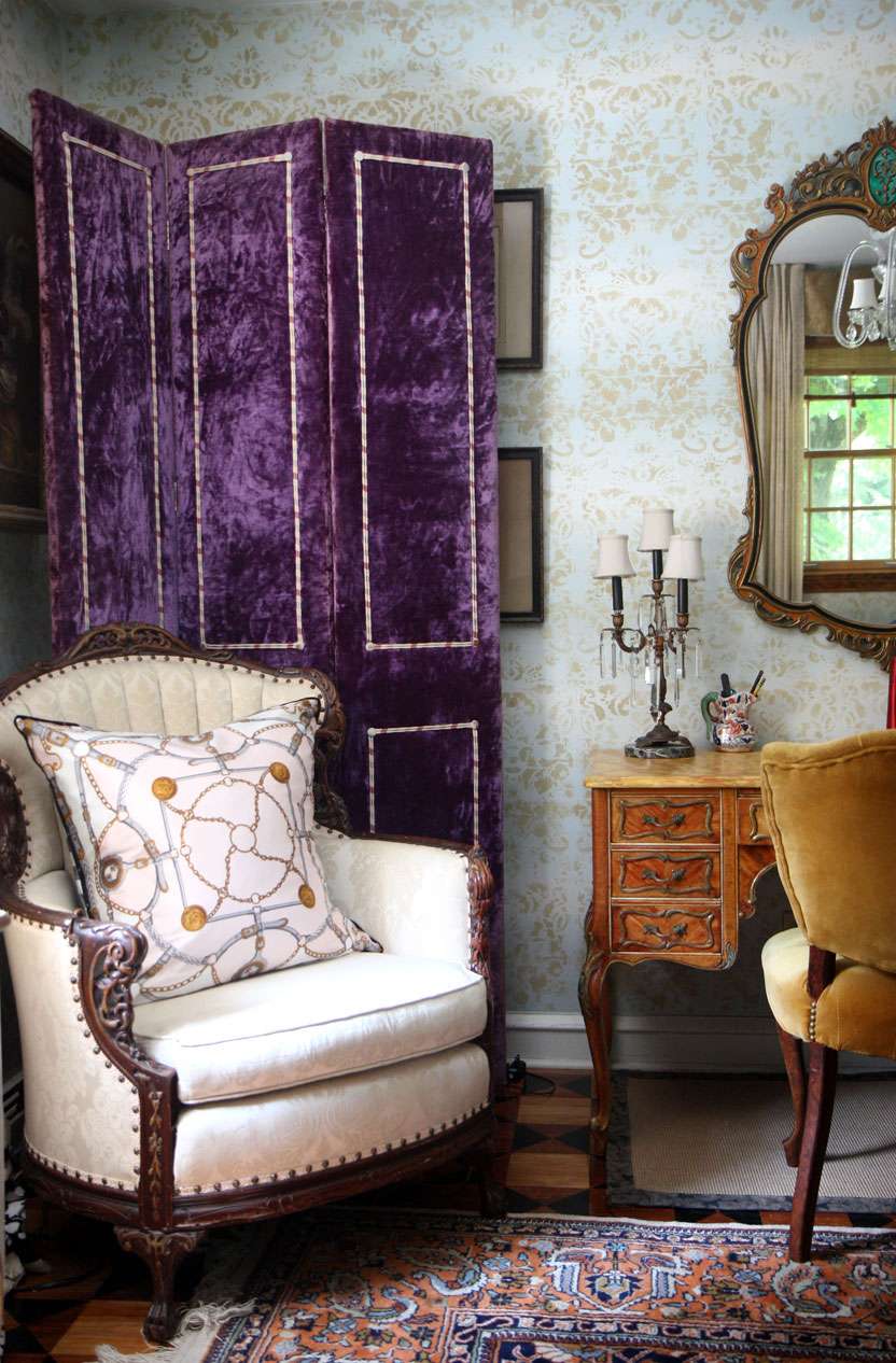
The newest incarnation of the infamous purple velvet screen. As much as I love the plush purpleness, I'm kind of in a Denning and Fourcade/Tony Duquette "pile it on" mindset at the moment. Just in case that isn't painfully obvious, ha.
Labels:
denning fourcade,
interiors,
my interiors,
purple velvet,
tony duquette
8.29.2009
Let Them Eat Cake
Lately, I've been shamelessly drawn to the idea of living life in varying shades of pastel. Think thick gobs of cake icing, Florine Stettheimer paintings, and jordan almonds.
Light aquamarines, pale pinks, nudes, golds and grays; there's something delightful and fantastic about embracing such an overtly...feminine...color scheme.
Here are a few of my favorite pastel "moments," where good design transforms what could easily become a child's playground style disaster.
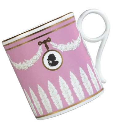
1. Wedgwood Pink Cameo Archival Mug. This was actually recently featured in a British Vogue feature of Plum Sykes's favorite things. However, it's near impossible to find as Wedgwood discontinued it a while ago.
2. Marie Antoinette with Kirsten Dunst is like fashion photography in motion, a giant layered cake full of aquamarines, pinks, peaches, frosty whites, ruffles, tulles, silks, and crystals. It's divine. Unfortunately, it's a miserable movie on most other accounts (plot: it has none; acting: lackluster).
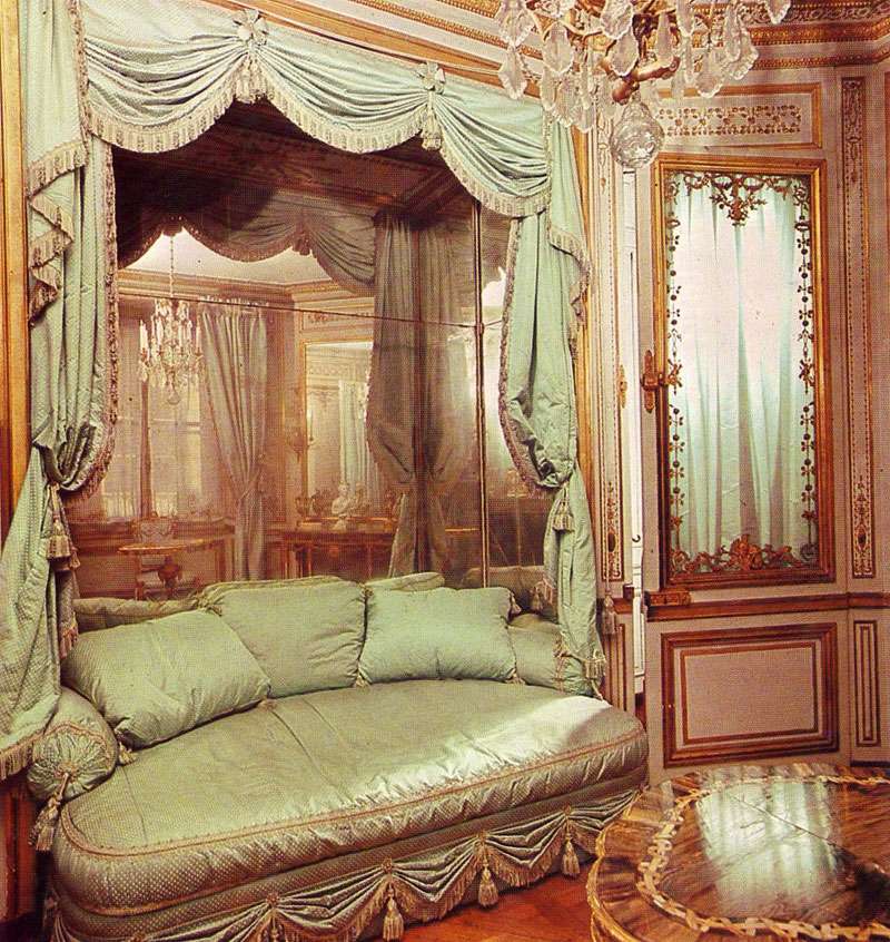
3. As it turns out, Marie Antoinette's actual rooms were more glorious than the movie's sets that they must have inspired. Below, the Méridienne, a small room decorated by Richard Miqué for Antoinette in 1781. The delicately luxurious couch is to die for. Scan from The Grand Tour: Homes of Kings, 1977.
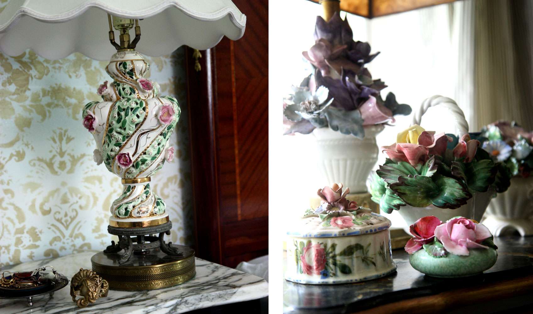
4. Antique Capodimonte porcelain lamps and ceramic floral bouquets. The lamp on the left is quite possibly the best lamp that ever existed, that's how much I adore it. Every night before bed, I contemplate eating it, since it could pretty much double as a cupcake.
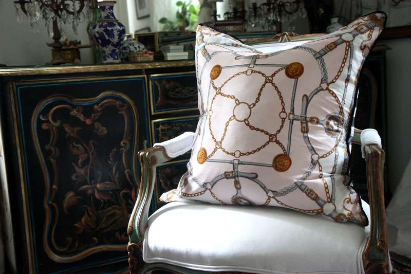
5. At the moment, I'm very much into oversized silk scarf pillows. I made this one with a delicate Oscar de la Renta scarf, and backed it in a bold gray/white stripe.
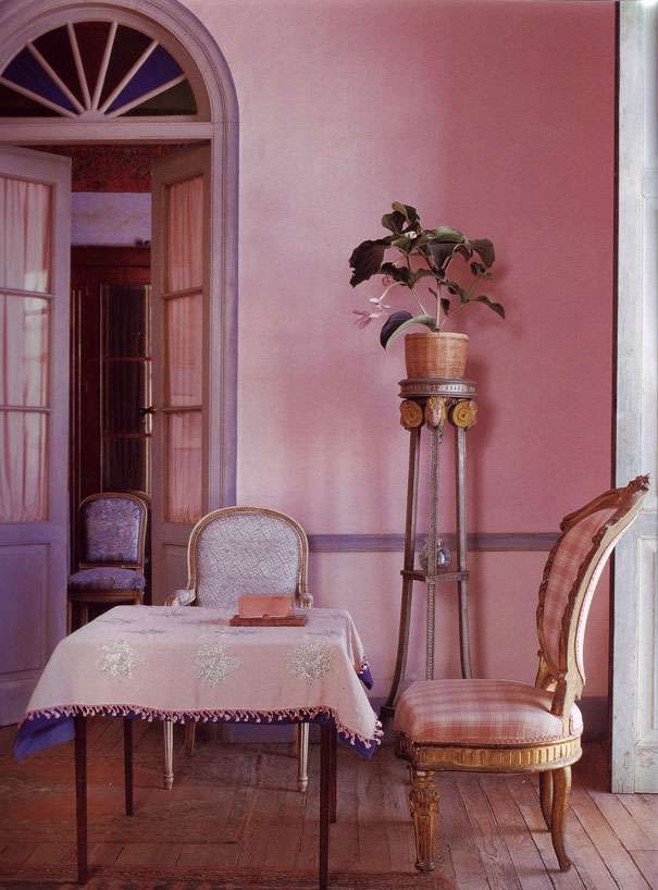
6. The dusty pink walls and blue gray woodwork of this room by Christophe Gollut mimic the palette of a sunset. It's a subtle use of pastels, and he makes the color scheme work brilliantly. Scan from Textile Style by Caroline Clifton-Mogg, 2000.
8.26.2009
Purple Haze
Picking up this purple velvet screen from a thrift store was probably one of the better decisions I've made this week. It's old, partially falling apart, made from cotton velvet, and weighs a freaking TON. Someone less inclined toward the hideous might have turned down an Elvis-esque screen upholstered in skinned muppet.
But hey, I love a challenge, pieces that really dare me to make them work, you know?
I knew I had met my match by the horrified snickers that my fellow shoppers shot me upon seeing my zeal for these gems (yup, there's another one, haven't decided what to do with that one yet).
I love items that straddle the line of bad taste. The saving grace for this screen is really the age, patina (worn patches and yellowed areas), weight, and quality of the materials (no polyester here, kids). And I think it's working out pretty well. I'm contemplating painting panels for the inset areas. We'll see where it goes.
Labels:
decorative screens,
interiors,
misc,
my interiors
8.24.2009
Seeing Stars
The library of Lord Byron, in his palazzo in Pisa, Italy.
Obviously, this moody image speaks for itself, especially the metallic ornaments on the ceiling that have a way of floating above the dustiness of the rest of the room.
Lord Byron moved to this palazzo in Pisa, Italy as an exile. Legendary poet and self-promotional womanizing rock star of his day that he was, Byron quickly turned the house into a meeting place for romantics and revolutionaries, including Percy Bysshe Shelley, who also lived in the city.
Aside from the fact that this room (and its provenance) is just really superb at inspiring fantasies of all kinds, I love it also because of its color palette. The dusty blues, lavenders, taupes, grays and aged metallics make a divine combination that could easily be put to use in any room, regardless of size or palazzo status.
8.23.2009
Bathing Beauties
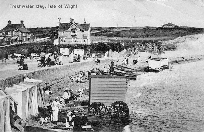
What are these caravan-type deals lined up on the beach for, you ask? They are, of course, bathing machines from the turn of the century! Ever the overwrought contraption-loving lot that the Victorians were, they devised these canvas covered horse drawn wagons so that ladies could maintain modesty while bathing in the sea.
At first I think, dear god, this is HORRIFIC! I mean, what's the beach without the babes, right? Also, something about utilizing what is essentially a portable turn-the-sea-into-a-cavernous-tub device is inherently unappealing (these things have no windows!!!). But then my mind wanders towards the weekly summer tabloids awaiting me in the grocery isle, with all the botched triple-stapled stomachs and dimply lipo jobs (think Tara Reid- she's an old classic in this genre, for sure), and suddenly these machines are looking pretty glorious.
Labels:
Bathing Machines,
fashion,
misc,
parties,
Postcards,
Victorians
8.22.2009
And They Partied Themselves into the Ground
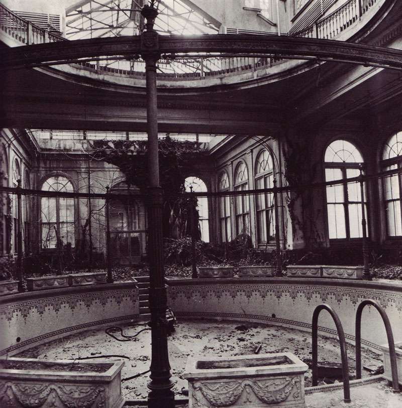
"Contrary to the image of high society, it was the fad of the day for lady guests to fling their lingerie to the winds as they passed the gates upon leaving. Local folk still recall seeing chauffeurs ceremoniously retrieving their ladies' undergarments in the wee hours of the morning." - Monica Randall, on the parties that took place in early 20th century Long Island, New York.
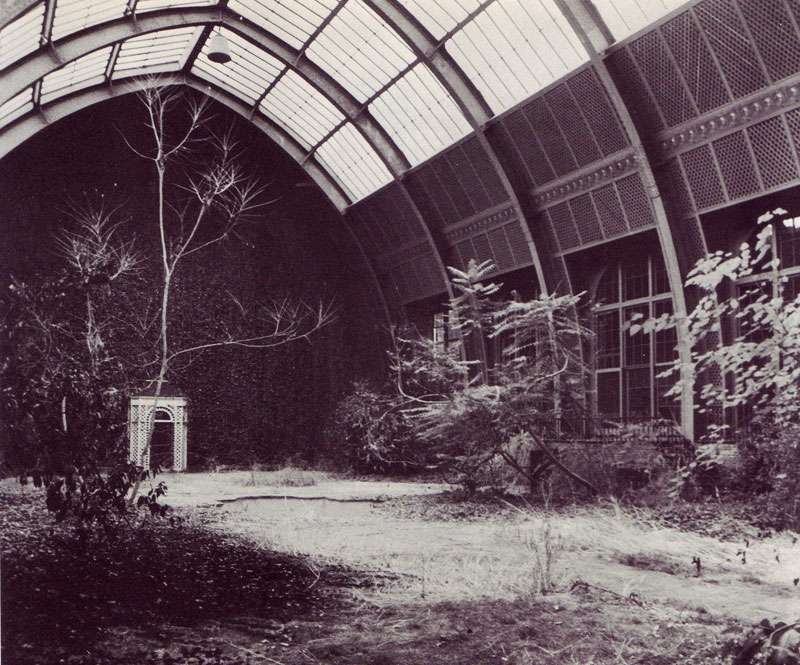
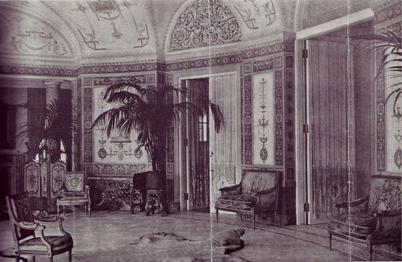
W.C. Bird Estate Oval Room, after 20 years of neglect. Long Island, NY.
Scans and quotes from The Mansions of Long Island's Gold Coast by Monica Randall, 1979.
A fantastic find at the thrift shop turned up these images of dilapidated grandeur, all taken in the once palatial homes of 1920s Long Island, New York (the setting for Fitzgerald's The Great Gatsby) before they were demolished in the 60s and 70s. As you can see, many were abandoned and fell carelessly into ruin; there are stories of mansions being bulldozed with tiffany chandeliers still hanging from the ceiling.
That the parties were so overly decadent makes these images that much harder to stomach. Highlights includes the Kahn's yearly easter egg hunt where each egg held $1000.00 and Bradley Martin's "Come in the most expensive costume you can devise" party, given at the height of the depression, of course. And then there were the ducks that one mansion owner had a chauffeur personally deliver south for the winter, rather than have them fly, commenting, "...of course they can fly; thank God they don't have to."
Labels:
entertaining,
gilded age,
Gold Coast,
Great Gatsby,
interiors,
Long Island,
parties
8.19.2009
Inspired By: Donald Deskey
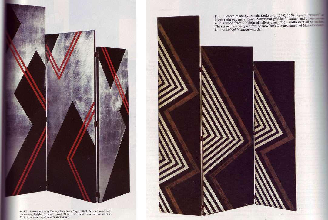
Came across a fabulous article in the May 1987 issue of The Magazine Antiques about artist Donald Deskey's (1894-1989) screens:
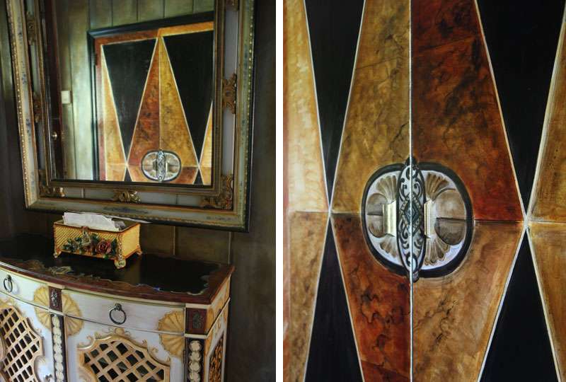
Which were a source of inspiration in the creation of my closet doors:
Deskey was primarily a set and window designer, who created his graphic, art deco/streamline modern screens and paintings for everyone from Muriel Vanderbilt to Saks Fifth Avenue, and became famous for the decoration of Radio City Music Hall in the '20s. He also did ad work in his later years— Deskey was behind the Tide bullseye and the Crest toothpaste packaging. It makes sense considering the graphic nature of his designs but it's surprising nonetheless.
A quote from the article in Antiques:
As a reviewer commented in 1929:Well said, reviewer from 1929; that is positively the most poetic way I've ever heard someone address the topic of a screen! More people should use screens. Even though not all of us have the problem of needing to shorten a "too-long vista of a great room," most could probably benefit from that peculiarly modern pattern of light that screens cast. Or the sense of enclosed intimacy they create.
Screens have many uses that are utilitarian; the concealment of passageways, the shielding from drafts, to mention a few, but as a rule their present day use is an artistic one. They shorten the too long vista of a great room; they deepen the shadows in the corners in which they stand, and their angled surfaces offer a peculiar variation of light and shade that in itself is decorative.
Labels:
art,
art deco,
decorative screens,
Donald Deskey,
interiors,
streamline modern
8.10.2009
A tiger at Sotheby's, 1999
The reason you should buy some quality tiger upholstery, NOW:
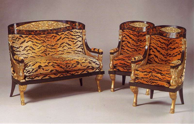
19th Century Continental, Neoclassical settee and armchairs, auctioned at Sotheby's May 4, 1999. Estimate: $20,000-$30,000.
A while back I did a post about Laura Bush's decision to upholster a particular settee in tiger print. She was RAILED for this decision, both by People Magazine (who compared it to Elvis's jungle room) and apparently her mother in law.
I didn't see what the big deal was then, and I still don't now. The concept of using tiger on classical pieces 1. isn't new and 2. doesn't necessarily indicate that one harbor's dreams of Elvis plopped on said settee, singing "Heartbreak Hotel" clad in white polyester.
This image of a 19th century settee auctioned at Sotheby's in '99 reminded me just how exciting tiger can be, minus the Elvis imagery and shag carpet, of course.
Labels:
interiors,
products,
sotheby's auction,
tiger print,
tiger settee
8.05.2009
Venetian Safari
Nautical + Leopard. Unlikely combo, but leopard does a nice job of punctuating a sternly graphic nautical motif. Thoughts?
Created, styled and photographed by (IN)DECOROUS TASTE
Wednesdays with Wackos
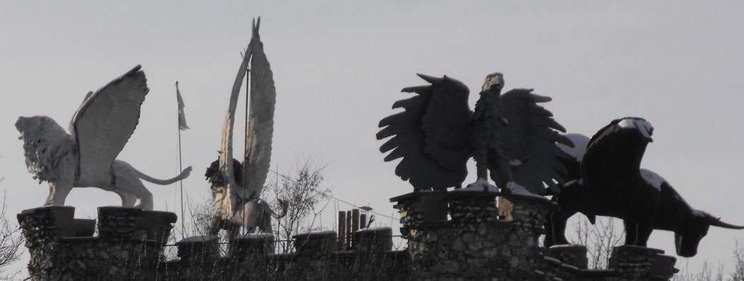
In accordance with the ongoing fascination I have with eccentrics and people that otherwise show no inclination towards self-censorships and instead tend toward indulgence, (although this may be an understatement), I present you my first addition of "Wednesdays with Wackos." Loveable wackos, to be sure. This week, we have a little architectural folly constructed by Robert Garcet in the 60s, located in Bassange, Belgium.
Let's see what we're dealing with:
-Four horsemen of the apocalypse
-Sitting atop a tower built by a self-declared pacifist obsessed with biblical numerology (think number grids that add up to "666" in all directions... you get the picture)
-Situated on an ancient, and ENORMOUS, labyrinth of tunnels that may or may not have at one time existed as an entire city.
I love people who take it upon themselves to materialize their own fantasies. Even if those manifest themselves as a dungeons and dragons plot.
And, as a sidenote: Will you look at the sheer SIZE of those four horsemen in relation to the tower itself?! Amazing.
Labels:
Architectural Follies,
art,
interiors,
people,
Robert Garcet,
Tower of Eben-Ezer
8.03.2009
Happy Birthday To Me
Except, super belated, because my birthday was on the 22nd.
Simple outdoor dining, with my FAVORITE hand painted antique green striped Czech plates, an ebay steal from ages back. Somehow, I think greens are well suited for outdoor dining in that they bring out the texture and color of surrounding shrubbery and foliage. And of course, a little metallic and crystal never hurt anyone.
What you DON'T know is that it started monsooning a mere, oh, 4 minutes from when this baby was taken. What a scene. Good thing my guests were quick on their feet. I kid you not, the whole table experienced a god like resurrection that took place as quickly as the rain started coming down. Much thanks to everyone who came!
Labels:
czech porcelain,
entertaining,
interiors,
my interiors,
outdoor dining,
parties
Subscribe to:
Posts (Atom)