1.31.2010

RICH CARPETS, QUILTS, THE DEVIL AND ALL

Anthony feigns him Sick of late, 
   Only to shew how he at home, 
Lies in a Princely Bed of State,
   And in a nobly furnish'd Room,
Adorned with pictures of Vandike's,
   A pair of Chrystal Candlesticks,
Rich Carpets, Quilts, the Devil, and all:
   Then you, his careful Friends if ever
You wish to cure him of his Fever,
   Go lodge him in the Hospital.

"Epigram de Mons. Maynard," by Charles Cotton, 17th Century.

I guess hospitals were as horrendous then as they are now? 

Rich Carpets, Quilts, the Devil and all...bring. it. on. The Borromeo villa fits the bill nicely, I think:

Below, a luscious bedroom in the Borromeo family's villa, built in the 16th century on Isola Bella, in Italy's Lago Maggiore.   
Above, Scan from W, January 2010 

According to W Magazine, the Borromeo's still vacation at the villa in the summer months: 
"Maggiore maintains a quieter and less crowded air than Como, its glitzier, more celebrity-filled neighbor to the east.  That's George Clooney— those people," the Principessa scoffs."
Above, Isola Bella, via Wikipedia Commons

1.29.2010

WILD BEAST

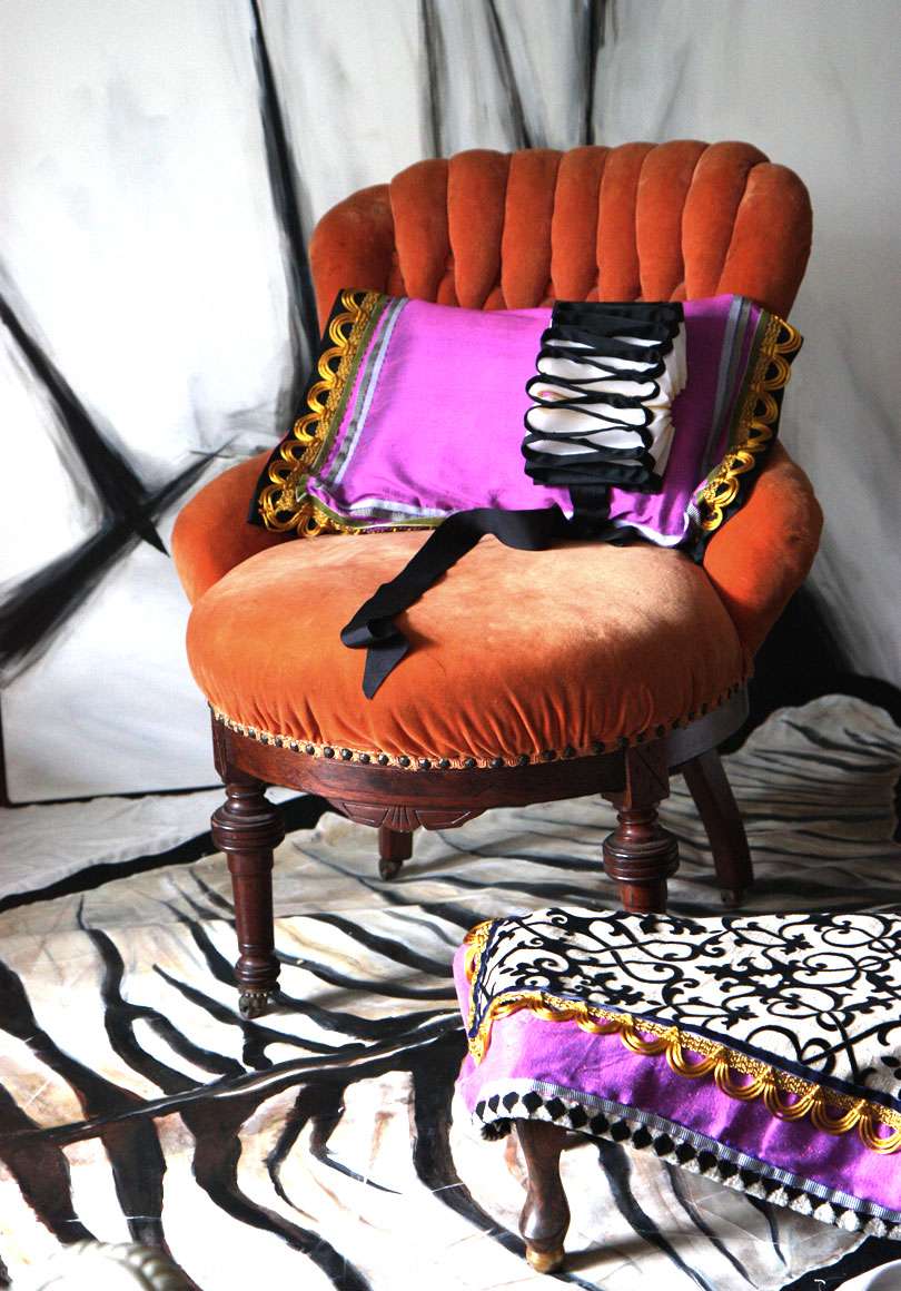
Orange + Pink. Hot? Or a hot mistake?

I picked up a set of these very orange tufted velvet chairs (I'm thinking Victorian?) at the thrift shop a little while ago.  I have a love/hate relationship with the color; it reminds me of fauvist paintings.  So, I did the fauvist thing and threw on some pink. Now, it's a wild beast.  IT SCREAMS!

Love? Hate? Yes? No?


Styled and photographed by (IN)DECOROUS TASTE. Pillow/ottoman upholstery also by (IN)DECOROUS TASTE.

1.27.2010

Enemy Crushers

Have you ever noticed that Louis XIV is nearly always captured in portraits donning talons rouges (red heels)?  Red was a privilege extended only to high ranking members of the court.   In Love and Louis XIV, Antonia Fraser suggests that this was because"...they were always ready to crush the enemies of the state at their feet." Crush them like they crushed the rare cochineal beetle to extract the precious dye, I suppose?
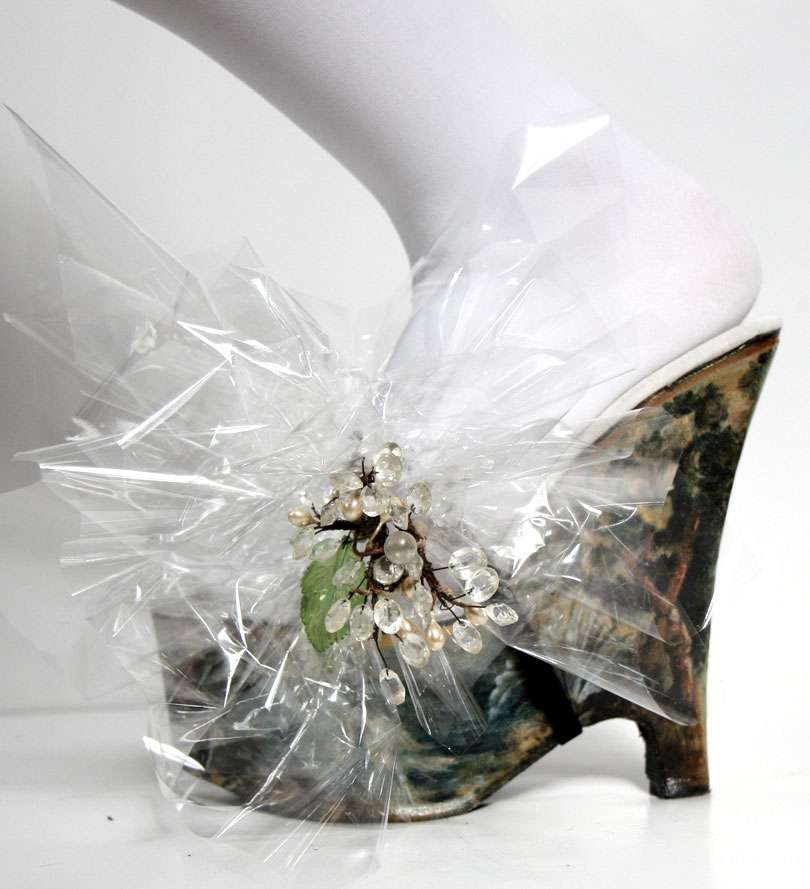
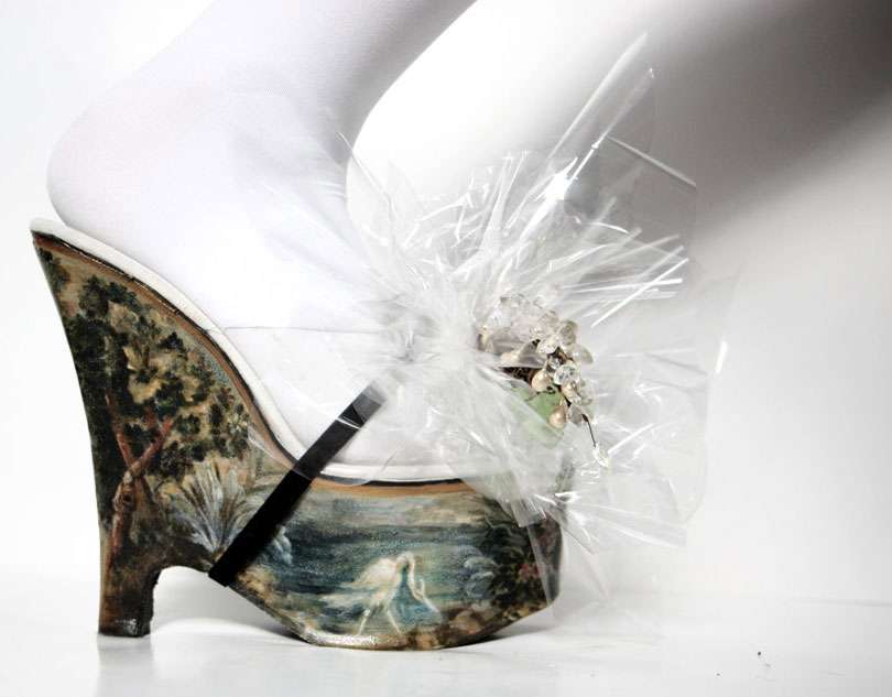
Other high ranking men in Louis' court wore shoes with miniature scenes painted on them— either rustic and romantic scenes, or battle scenes, depending on the source.  Louboutin already has red covered, too common.  If Louis were alive today, I'm sure he'd trade out those talons rouges for something more dramatic, with more pomp and circumstance.
These were made with canvas, cut and glued to the wedges of these (formerly ruff-bedecked) heels and then painted with a scene inspired by old verdure tapestries.  As you know, I worship my triumvirate of G's (grit/grime/gilding).  I didn't quite capture it, but there is a fair amount of gilding in the painted part of the shoe.  Has it gone too far?! In any case, I'm fairly certain I'll be able to play camouflage in this room, quite successfully.

The explosive bow harness is cellophane, what else? I bet Louis would have loved cellophane, had it been around...


Shoes styled, painted, and photographed by (IN)DECOROUS TASTE.

Ancestral Chair

If I could have just one chair (and what the hell, an ottoman too)...


Above, James II (1633-1701)'s Restoration-era baroque armchair and stool from Knole House in Kent, the ancestral home upon which Virginia Woolf based her novel Orlando.   (As an aside: has anyone seen the movie Orlando? Evidently one was made in '92 starring Tilda Swinton. I love Tilda Swinton. And ancestral homes, for that matter.)

"The [English baroque] style bespoke drama...Contrasts between light and dark, between rich textures and colors, were stressed. To render the inanimate lifelike, to astound, to overcome the limitations of materials themselves were primary concerns..." -Henry Joyce, in "Restoration Pieces: How English furniture went baroque," Art & Antiques, May 1984. 


Sounds about right.

1.25.2010

LIVING LARGE

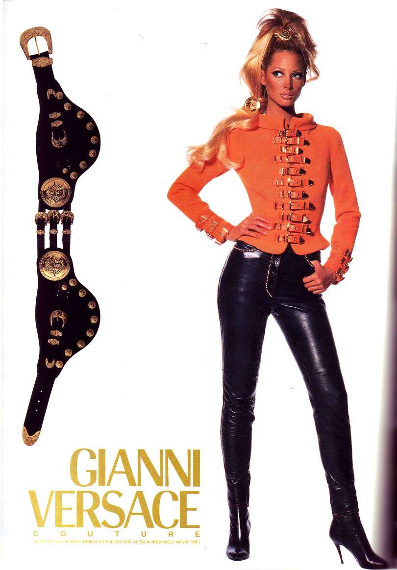
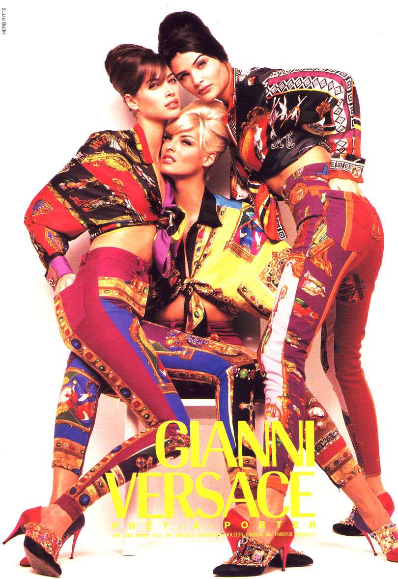
Over the top, in your face. Say what you will, but old-school Gianni Versace was killer.

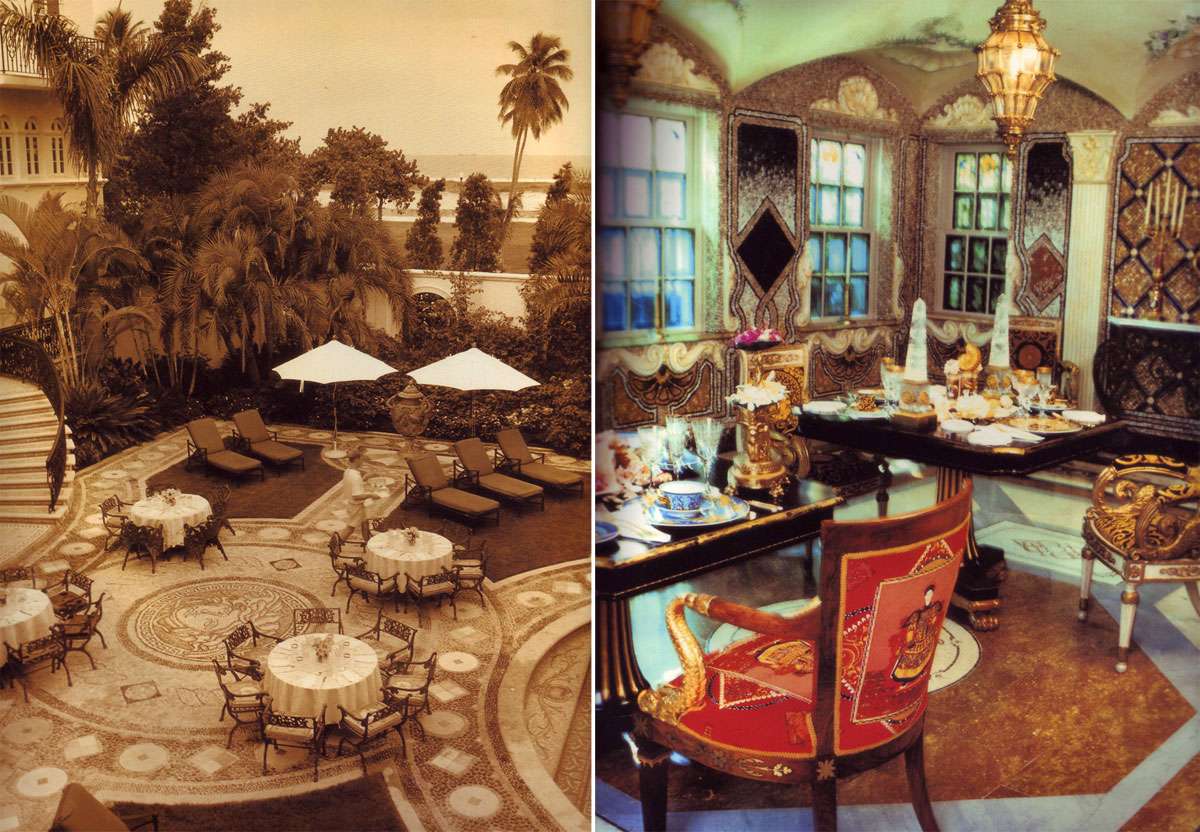
Here: three vintage Versace ads peeled from the pages of House & Garden, two videos featuring chain-clad gangs of amazonian supermodels (Naomi, Kate, Christy, Linda, Helena...) marching to Metallica and the 4 Non Blondes in '94, one of Gianni's residences, and a partridge in a pear tree... (No, but it's sort of like Christmas, isn't it?)

The image of the interior is Gianni Versace's Miami residence.  Evidently, it was a vast departure from his apartment in Milan, the Rizolli palazzo, designed by one of my nearest and dearest anti-decorators— Renzo Mongiardino.  I haven't seen this residence, but I'm dying to! Anyone know where I can find it?
Above, scan from September 1992 House&Garden
Above, scan from September 1991 House&Garden
Above, scan from April 1992 House&Garden

Above, Gianni Versace's Miami residence, scan from Vogue Living: Houses Gardens People.


1.24.2010

Cradle Robbing

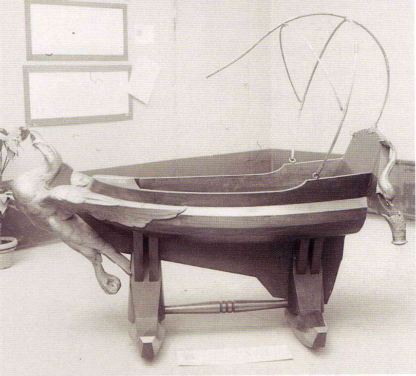
A cradle owned by dictator Benito Mussolini.

I have absolutely no use for a cradle. Can this be made in full size?

"Made for Il Duce's youngest son, it combines the theatrical gilded eagle prow (a sort of boat on legs) with the solidity of the best ninetheenth-century furniture, from a single block of wood. It must weigh a ton. Presumably the metal strut at the back was to stretch white linen over when Mussolini Junior was out in the sun."
-Peter York, in Dictator Style

1.23.2010

Aviator

Head to toe leather, Amelia Earhart (1898-1937).
Photo from the Smithsonian Institution, National Air and Space Museum.

1.22.2010

Interrogation

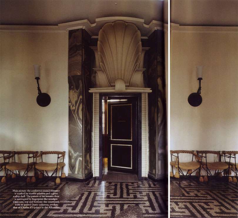
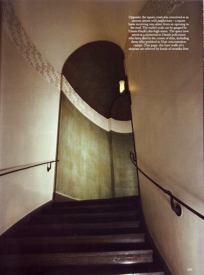
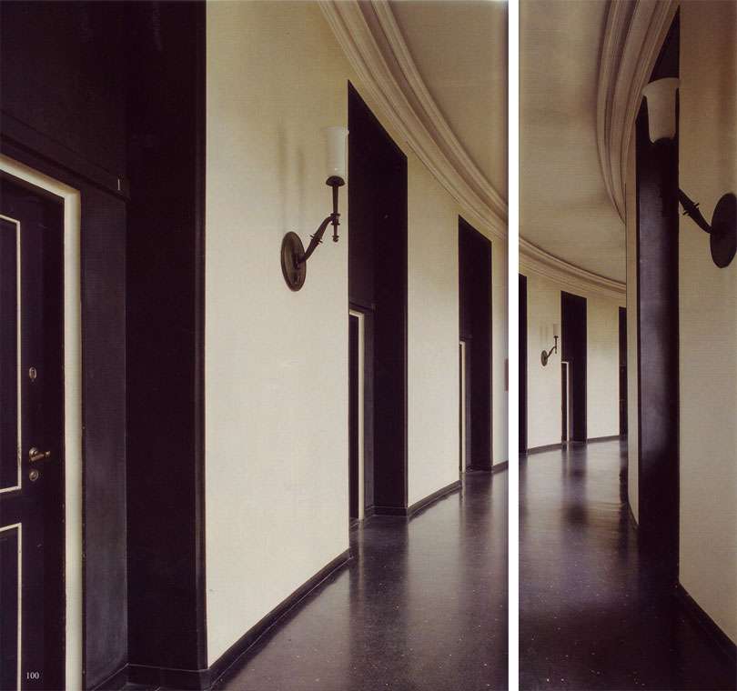
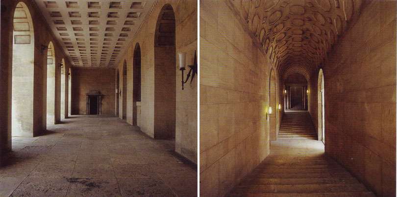
Had to scan these images from the January issue of World of Interiors. Can you believe it's actually the Copenhagen police headquarters? I've been bad this year...can someone please send me here to be interrogated?

Built in the 20s, it strikes me as a bizarrely wonderful twist on neoclassicism. For example: check out the "fingerprint" smudges on the floor.  I'm also infatuated with the larger than life shell, marble pilasters, chairs with giant tassels, velvety green paint...

All scans from World of Interiors, January 2010, "Arresting Offices." Photography: James Mortimer.

1.20.2010

The Italians Do It Better

This makes the Titanic look like a toy. I LOATHE cruise liners, but I would travel on this with glee.

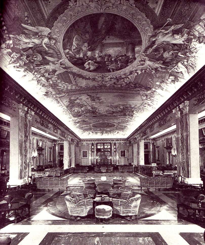
In reference to the Salone Colonna of the '30s Italian luxury liner the Conte Di Savoia:
The grand lounge was an explosion of Italian baroque, a floating Villa Borghese.  There was marble everywhere, on the walls, columns and underfoot, save for a heraldic carpet. The ceiling was an enormous vault painted with all the verve of the Sistine Chapel.  Around the room lay bloated fauteils covered in zebra stripes and hideously out of period.
                                                                             John Maxtone Graham, The Only Way To Cross 

Hm, hideously out of period? Those bloated fauteils are actually what made me love this image, as opposed to just liking it.  Of course, I'm as enthusiastic about glorious baroque "explosions" as the next steadfast believer in excess, but it's the juxtaposition with those giant zebra sofas that won me over.

Image of the grand lounge, or Salone Colonna, from The Only Way To Cross, by John Maxtone-Graham. 

Launched on October 28, 1931 for the anniversary of Mussolini's 9th year in power, the Conte di Savoia was only kept in regular service until Italy entered the war in 1940.  During the war, the liner was possibly used to ferry troops to Africa and then disguised as an island (?!!) in a marsh off of Venice, where it was bombed by America and ransacked by Germany.

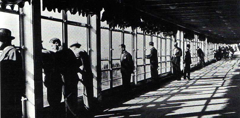
Below, a photograph of the once cutting-edge 900 ft long enclosed promenade.  This was a giant leap for fashionable women who didn't care for wind-whipped, soot-laden hair. I can empathize.

Image of promenade deck, from Classic Ocean Liners II: Rex And Conte Di Savoia by Frank O. Braynard.  

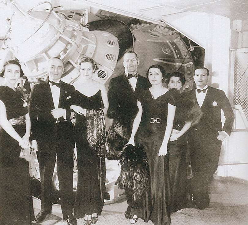
The Conte Di Savoia was also the first liner to have gyrostabilizers, in front of which this dinner crowd poses.  Incidentally, the gyrostabilizer looks a little like an alien spacecraft.  And what is that mass of glossy black plumage that the lady on the right is holding? I would like one, whatever it is...

Above, passengers posing in front of the ship's stabilizers. Image via New York Social Diary.

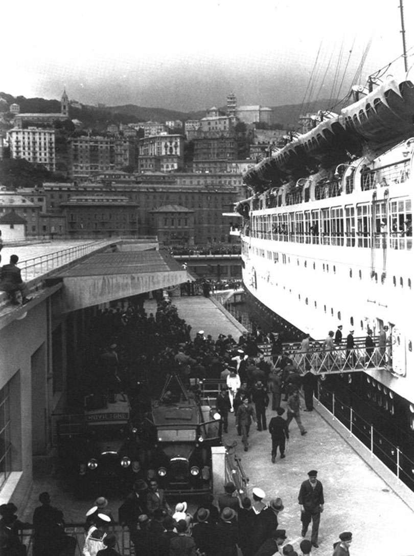
Above, the liner takes on passengers. Image via New York Social Diary

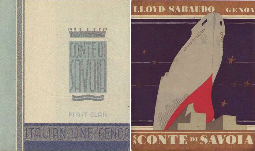
Above left, a folder issued to first class passengers, and right, a pre-launch brochure for the Conte di Savoia. Images from Classic Ocean Liners II: Rex And Conte Di Savoia by Frank O. Braynard.

1.19.2010

TO EEE

For her recently announced marriage, three things.

A toast...  Of Cristal crystal, only the finest!
Above, photographed and styled by (IN)DECOROUS TASTE.

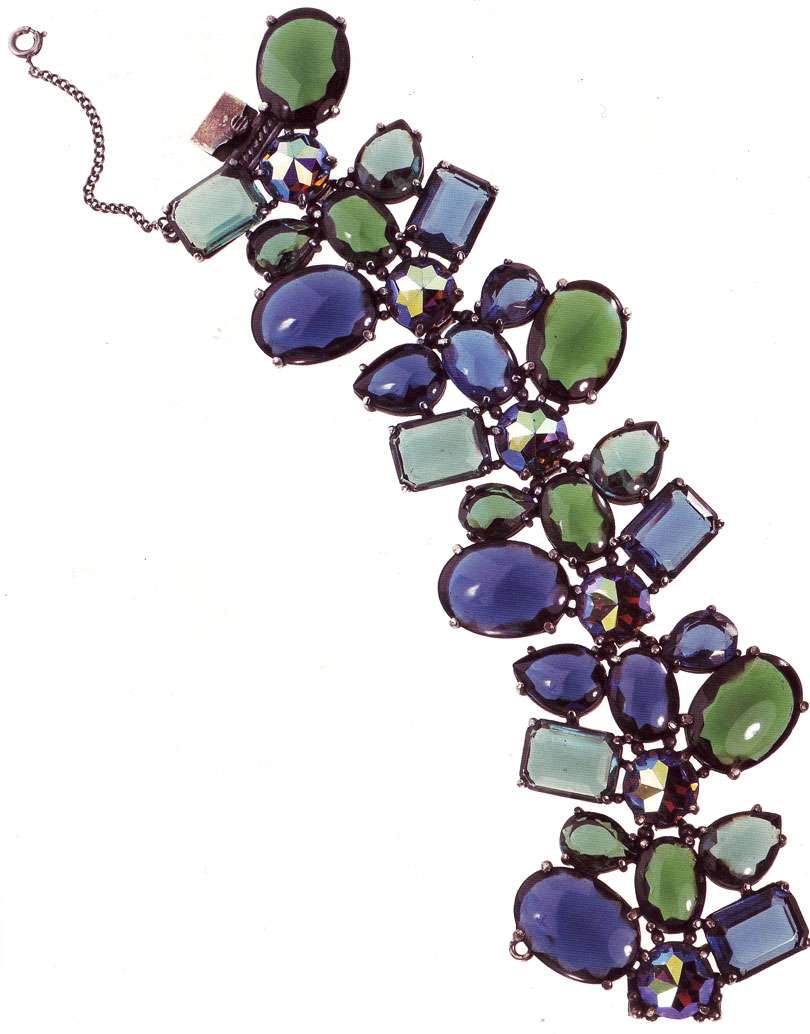
A vintage Elsa Schiaparelli bracelet, to go with the KILLER pink, petaled Schiaparelli hat that EEE found on Ebay (I am still ragingly jealous over that find):

Above, Elsa Schiaparelli fantasy paste bracelet, c 1950s.  Steven Miners, Cristobal, London.  Scan from A Collector's Guide to Costume Jewelry, by Tolkien and Wilkinson.

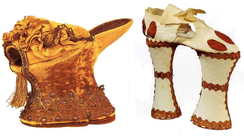
And finally, a literal pedestal upon which Mr. EEE can plant Mrs. EEE.  Two lovely shoes from Italy, c. 1600... stunningly gorgeous, astoundingly high, all the rage at the time, and reputedly impossible to walk in.  Evidently, these "chopines," as they're known, were favorites of husbands (because they so restricted movement that their wives were unable to go astray) and clergy (because they discouraged the sinful activity of dancing).  Psh, what nonsense.  EEE's a tough cookie— she'll conquer these shoes, and married life— with gusto.  CONGRATULATIONS!

Above, left: Venetian chopine, in cork and velvet with silver-gilt filigree, 1600. Right: A variety of chopine known as a "zoccolo," with 7-inch supporting columns. Italian, 1600.

1.17.2010

Ruffing It

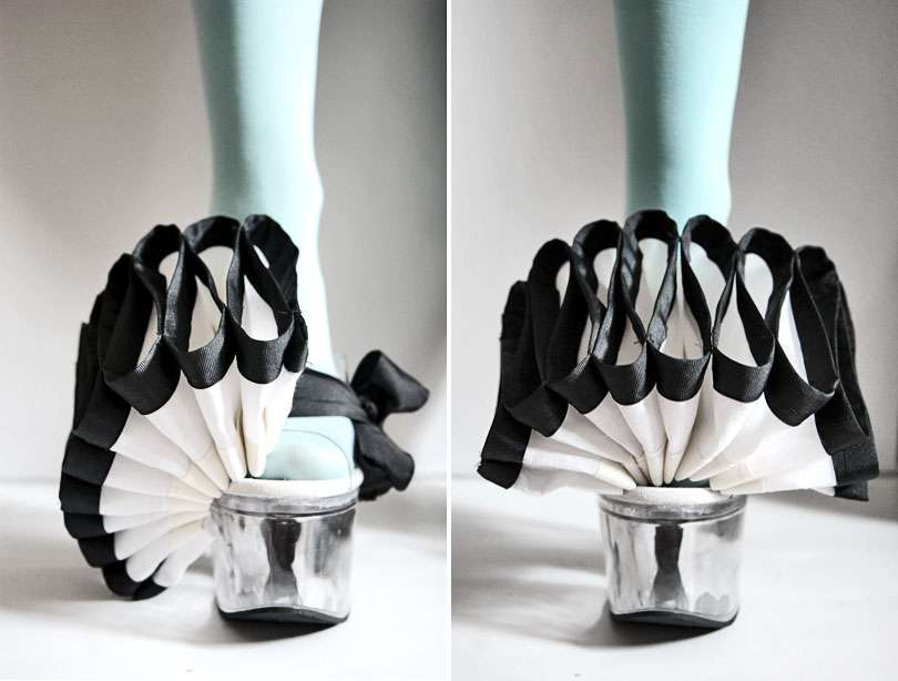
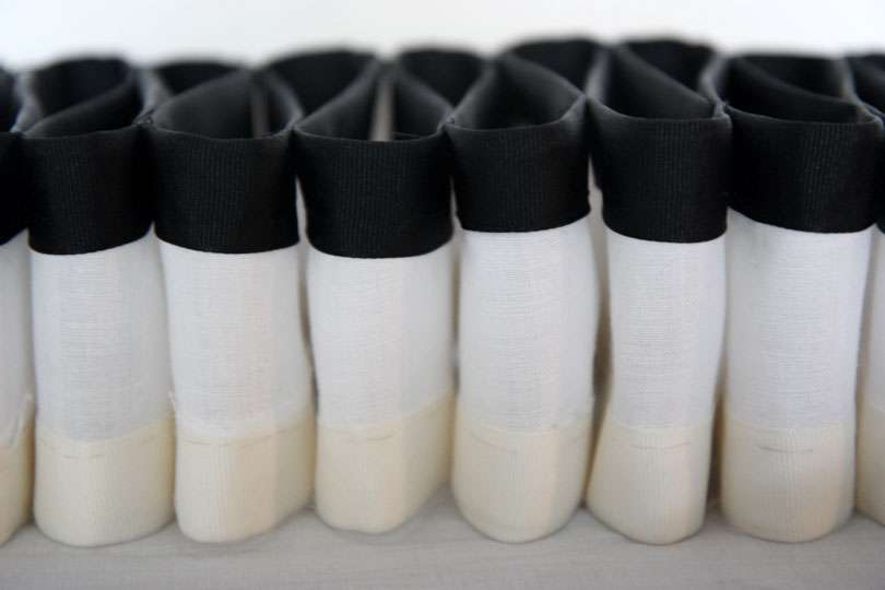
I love the idea of a ruff (you know, those large, decadent collars men and women wore in Elizabethan England?).  Maybe it's the extremeness of it all, the fussy excess that they embody, the unapologetic dedication to decoration (Garments just to hold up a decorative garment, anyone? Cone shaped irons to maintain those figure eights?), or maybe it's all the power and aggression that they imply, but for whatever reason, I'm drawn to those collars.

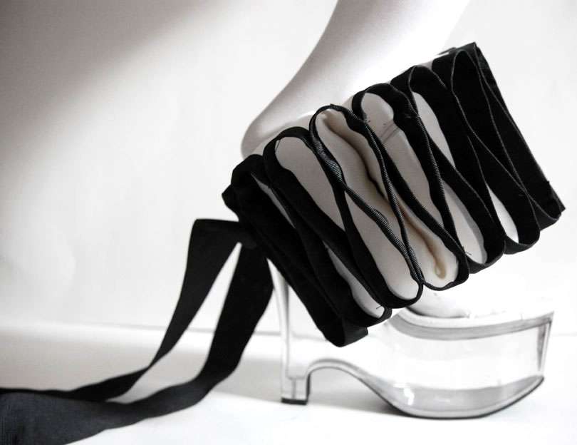
In an attempt to distill the drama, stately power, and glorious decorative excess from the Ren-Faire associations (ack, I could live without those), I came up with my solution: a ruff for the foot.  In the same way that ruffs as collars emphasize the head by making it seemingly levitate on the shoulders, these dramatize the foot.  The idea was for them to eclipse the foot in a giant mass of decorative ruffle and have it "hover" in thin air over clear plastic (stripper) 7" heels.  With all of that pomp and circumstance, we could use some grounding, right? Ha.

The process of making them was one of experimentation.  Ultimately, I ended up making a few models before this worked out, with linen, wire, grosgrain ribbon in cream and black, and a whole lot of spray starch.  Historically accurate? Not at all, in the slightest. But then, when has that ever been my goal?!


Styled, photographed and created by (IN)DECOROUS TASTE.

1.13.2010

Couch Potato

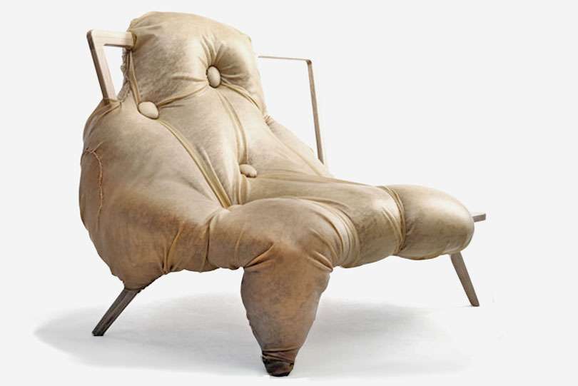
My first thought, when I ran across this obese chair by design student Charlotte Kingsnorth, was that it resembled artist Jenny Saville's paintings. Sure enough, it was indeed inspired by a series of her paintings, where the flesh of obese figures consumes the stools on which they perch.

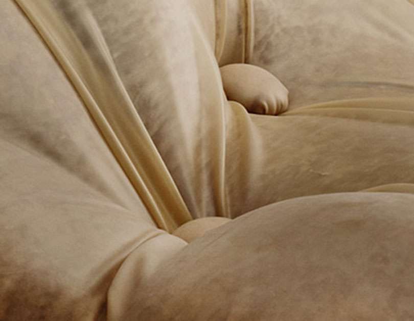
Personally, I'm captivated with Kingsnorth's use of material— the chair is upholstered in pink velvet and covered in latex sheeting, tufted in bulbous, irregular protrusions.   I've posted one of Saville's paintings just underneath, and you can really see how well the velvet/latex combo replicates the soft, mottled quality of Saville's paint. Viscerally disgusting? Yeah, definitely. But I'm intrigued. 


Above, At One by Charlotte Kingsnorth, 2009.

From a Dezeen article on the piece:
"At One is a sofa which has been devoured by its obese occupier,” says Kingsnorth. “It tells a story of a relationship between a person and their sofa and the evolution of their bond through time spent sitting together.
Above, detail of the latex-over-velvet upholstery

Above, Prop (1992) by Jenny Saville

1.09.2010

Lightscape

January is such a DULL month.  Hence, my attempts to greedily suck up all the sunlight humanly possible and make a shrine of it. And wear it.  Have I mentioned that I've been working on a pair of lucite shoes monster wedges?


Styling, photography and chinoiserie bird commode by (IN)DECOROUS TASTE.

1.08.2010

Bimbette

I save a ton of images.  They're everywhere, and I'm drowning in them— strewn about my room, in stacks, in folders, in books, on my computer, in my desk, under my bed, taking over my head and occupying valuable brain space...

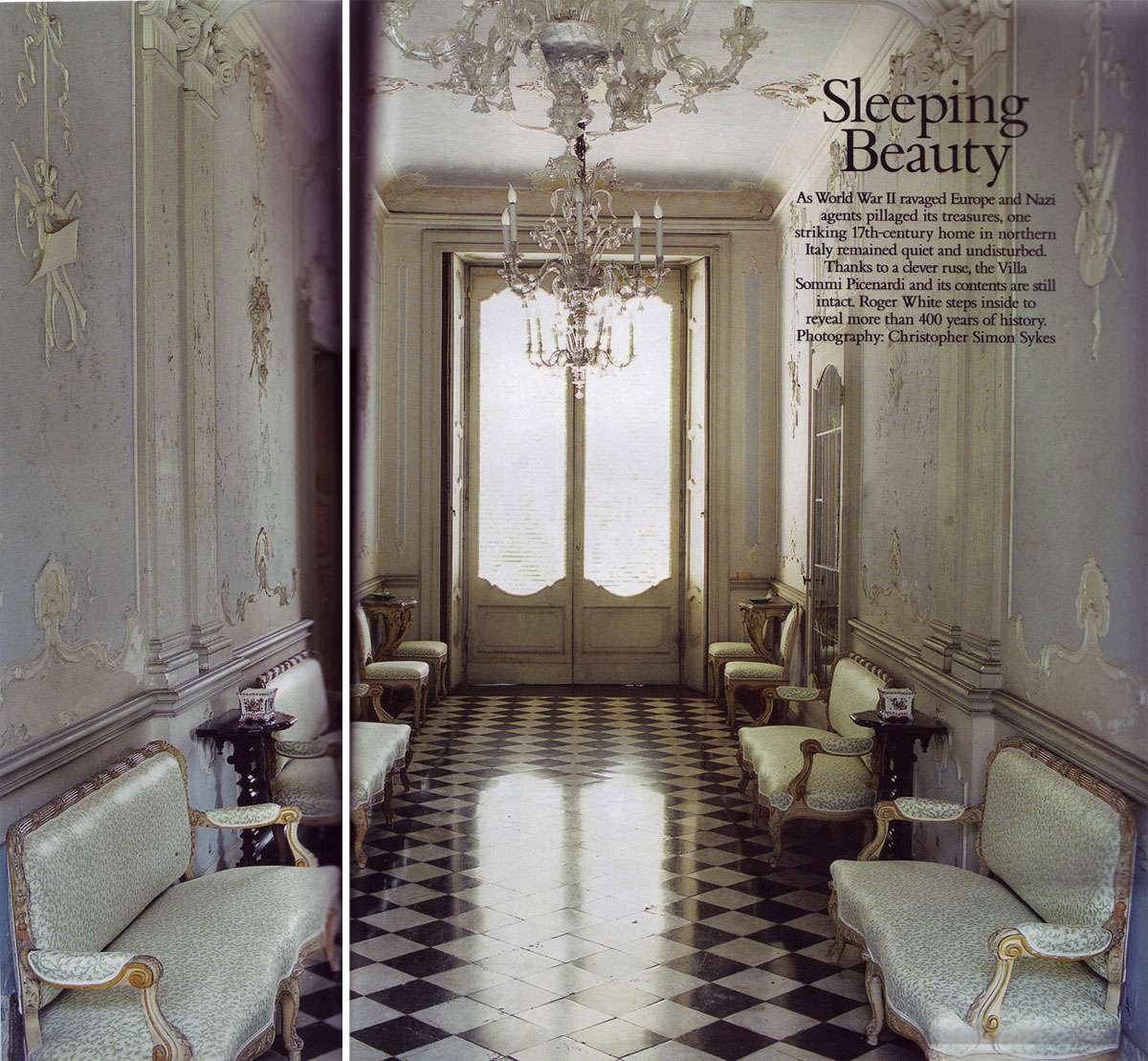
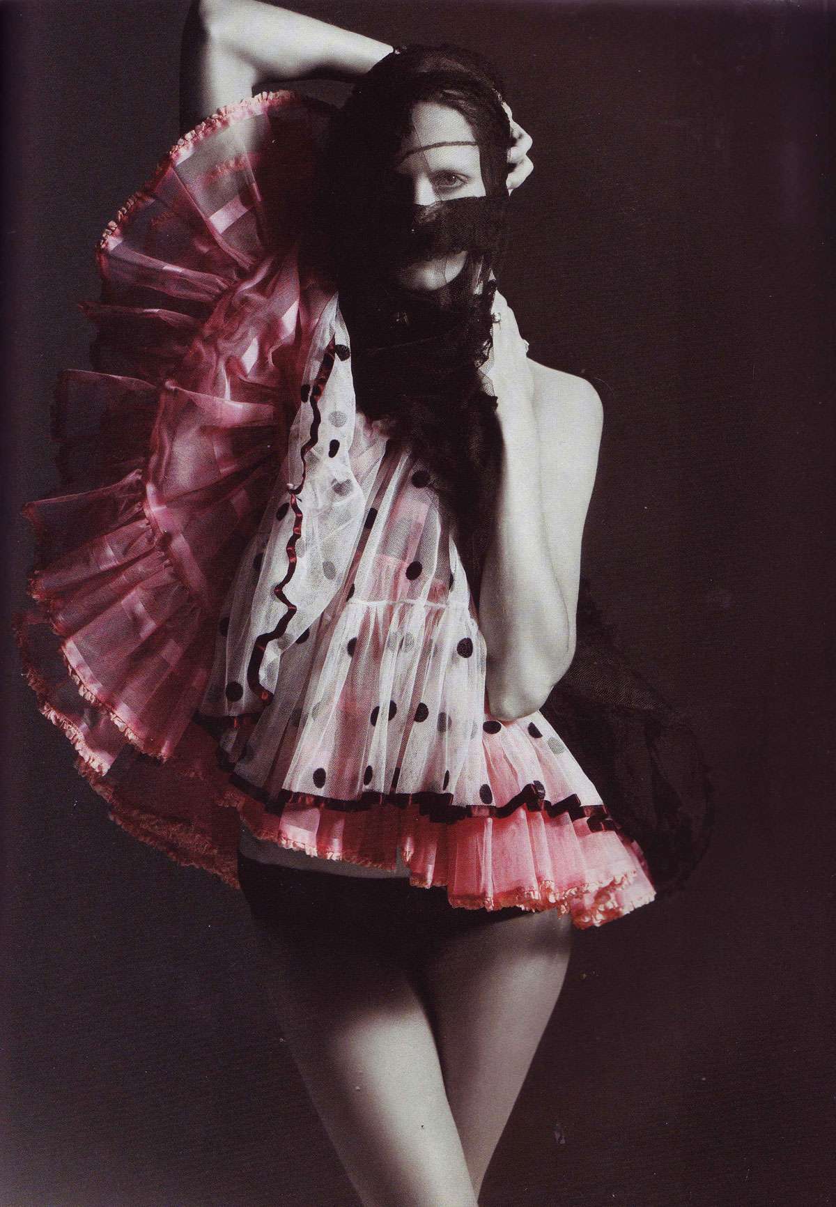
Attempts at organization have been futile, but sifting through the collection has provided (at times, frightening) insight into the things that catch my attention.  Evidently, one of these things is UNAPOLOGETICALLY EXTREME FEMININITY.  Feel free to turn your head now if pastels and polka dots induce feelings of nausea.


Above, Villa Sommi Picenardi. Photo: Christopher Simon Sykes. From World of Interiors, March 2009.

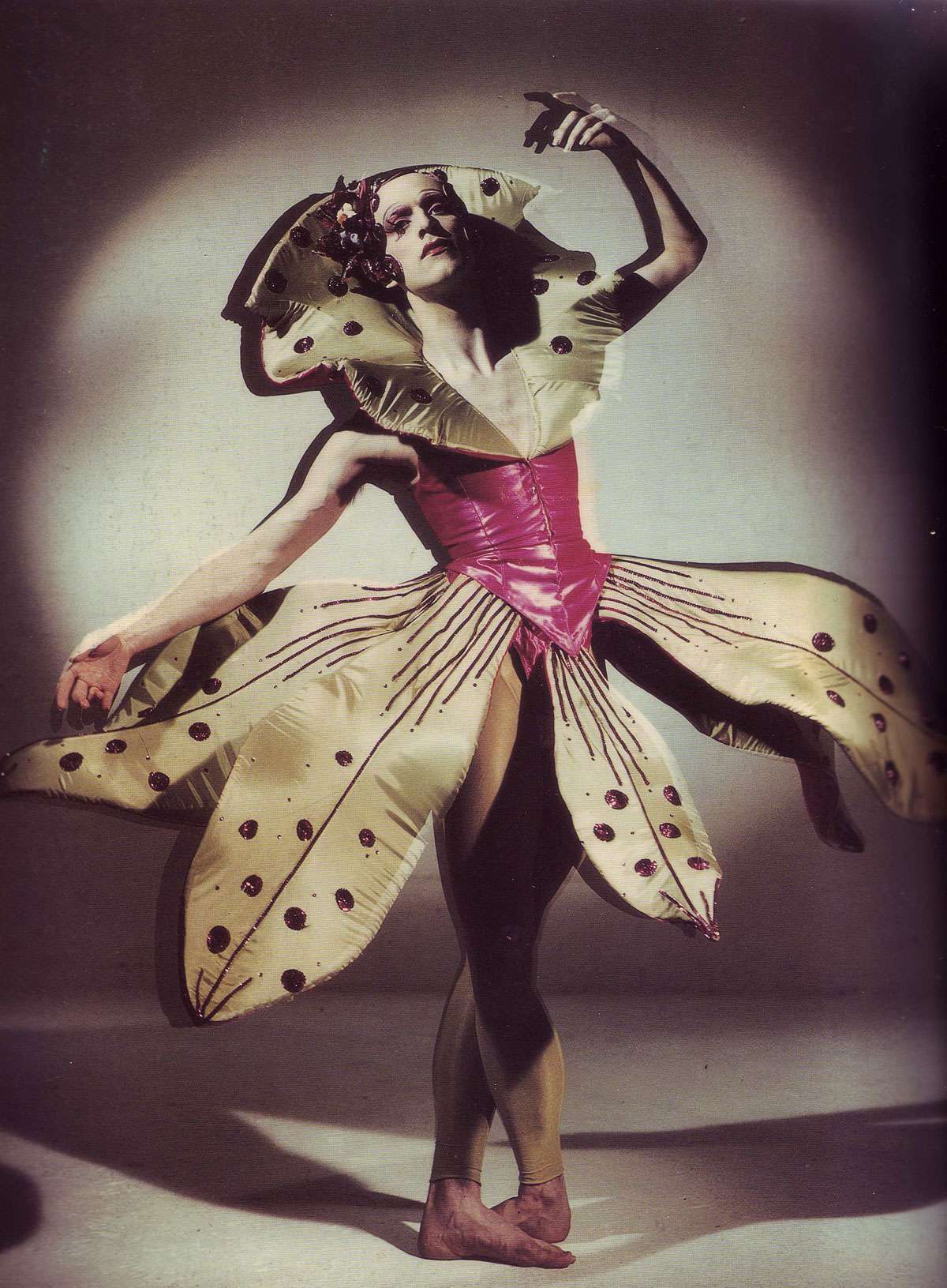
Above, 'Pearl', costume for the dancer Matthew Hawkins, late 1980s.  From Baroque Baroque, by Stephen Calloway.

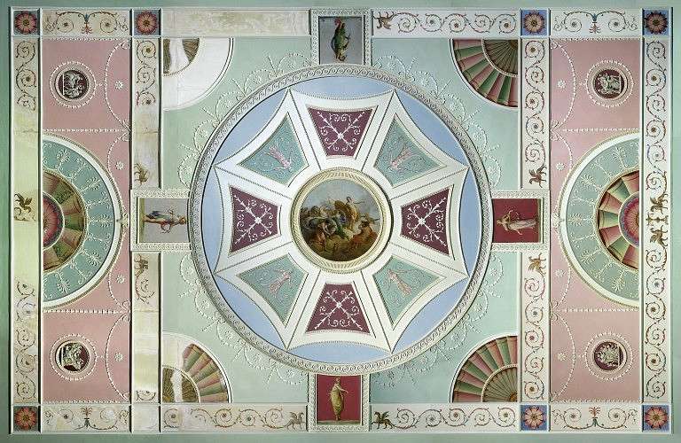
Above, ceiling by Robert Adam, painted by Antonio Zucchi, c. 1771. Via the Victoria & Albert Museum.

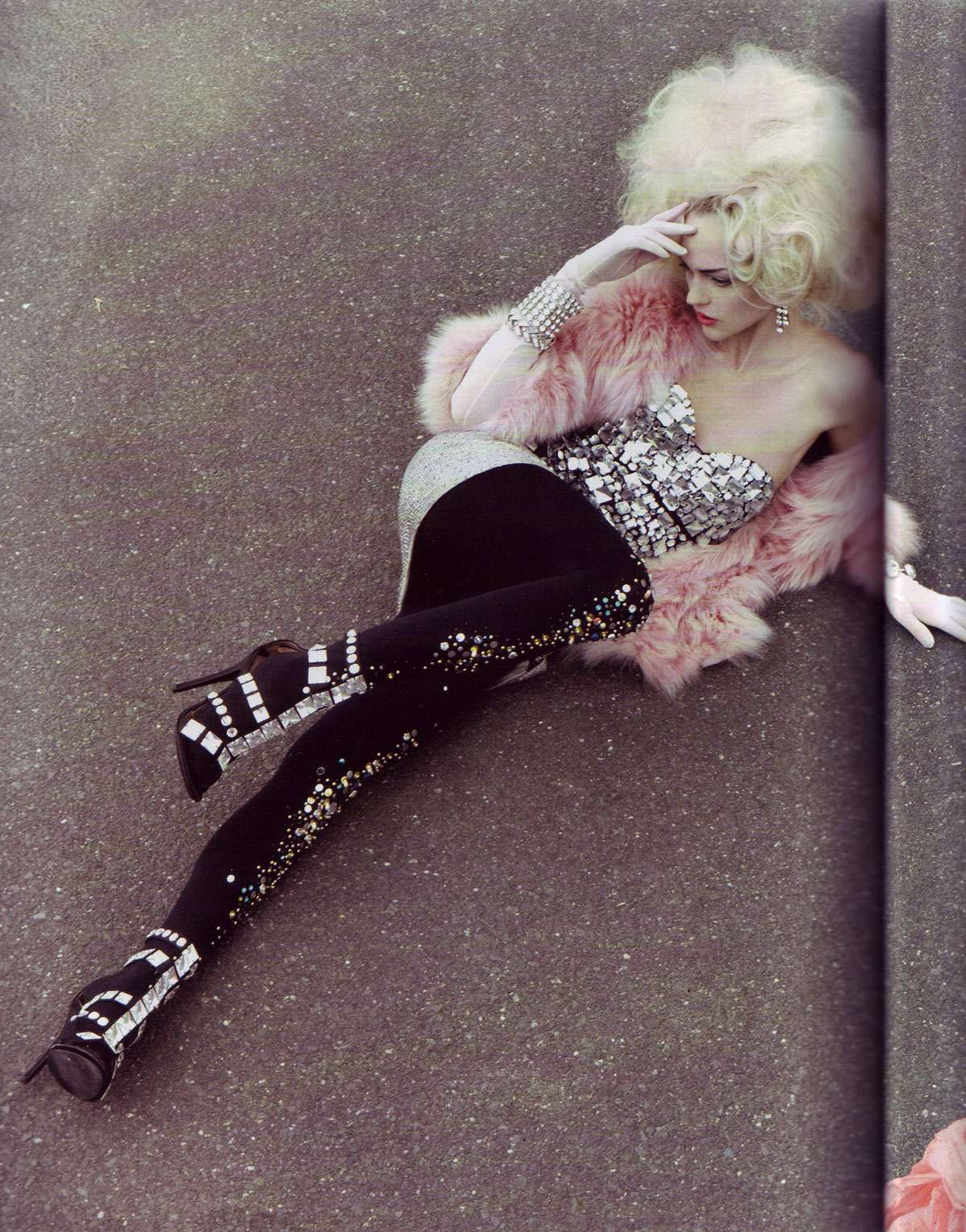
Above, from "It's a Matter of Glam" by Craig McDean, Vogue Italia, October 2009.

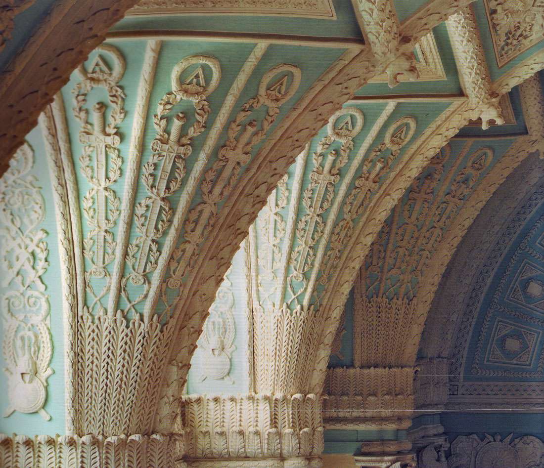
Above, The Alexander Hall, detail of the fan vaults.  Hermitage Museum (formerly the Winter Palace), St. Petersburg, Russia.  From The Hermitage: The History of the Building and Halls.
 
Above, Mme. Emile Straus, upon whom Proust's character Oriane, the Duchesse de Guermantes was based. Photograph by Paul Nader. From Art & Antiques, May 1984. 

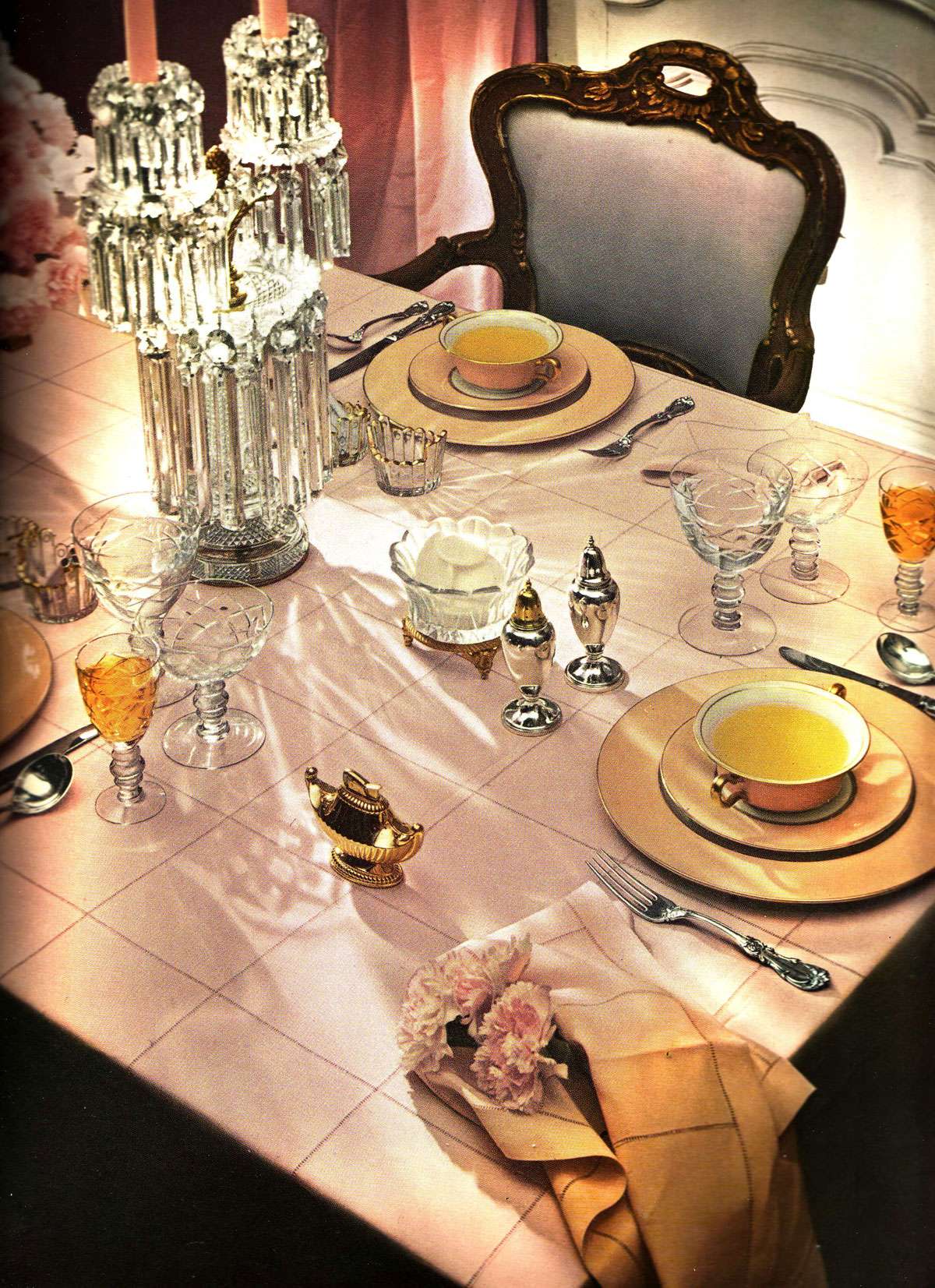
Above, "muted pinks make a pretty table." Photograph by Horst. From House & Garden's New Complete Guide to Interior Decoration, 1953.

Above, Chili Williams.  Photograph by Ewing Krainin, 1943. Reprinted in LIFE magazine, Fall 1986. 

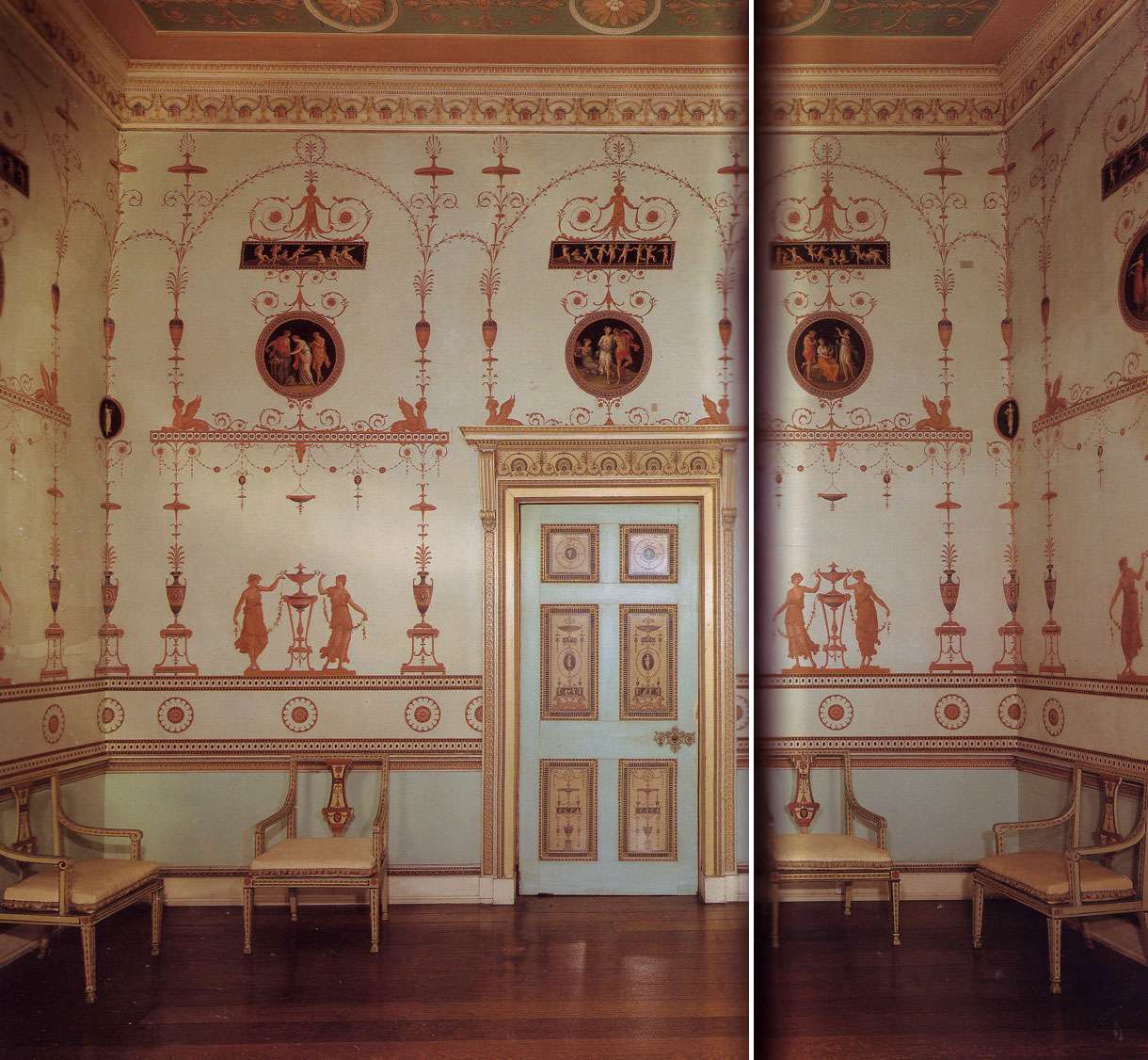
Above, Etruscan Room, Osterley Park, designed by Robert Adam, 1775-76. Victoria and Albert Museum, London. Scan from The Best of Painted Furniture.

Above, from "Last Vision" by Mario Sorrenti, Vogue Italia, December 2007.

1.06.2010

Epic Redecoration, Winter Palace Style

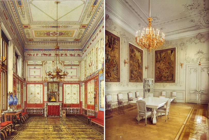
The small dining room in the Winter Palace of Czar Nicholas II and Empress Alexandra, before (left) and after (right) Alexandra's dramatic redecoration in 1894/95. 

Formerly known as the "Pompeian Dining Room," Alexandra obliterated the Pompeian ornamentation, gutted the intricate inlaid floors, added Rococo moldings, tapestries, and painted the entire room WHITE.  At the time, Empress Alexandra was heavily criticized for her taste and the royal court was horrified that she would stoop so low to purchase her furniture mail order from Maples of London.

Clearly, it was an epic overhaul. Less clear: Was it a mistake?

1.01.2010

BULLET PROOF VEST

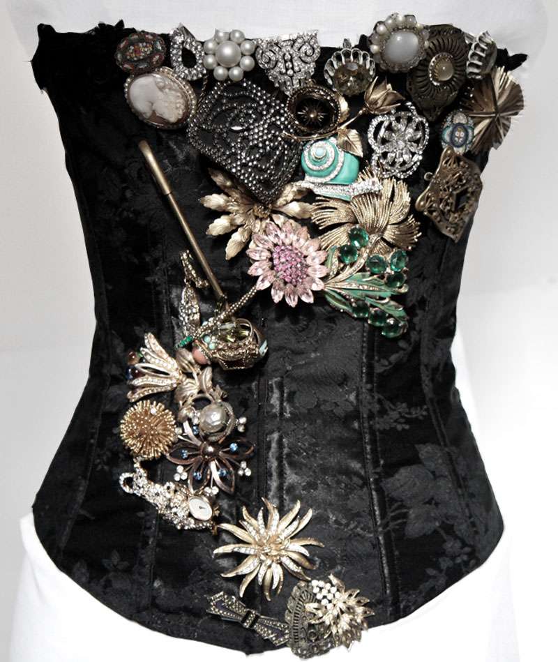
Ten pounds of costume jewelry and a black corset from the dusty depths of my closet makes for a happy New Year.

As an added bonus, I get the feeling it could double for a bullet proof vest, in case your debaucheries take you to less savory parts of town.


Styling and photography by (IN)DECOROUS TASTE.
Related Posts Plugin for WordPress, Blogger...