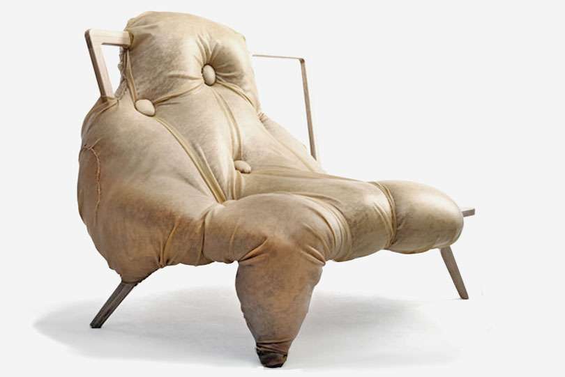
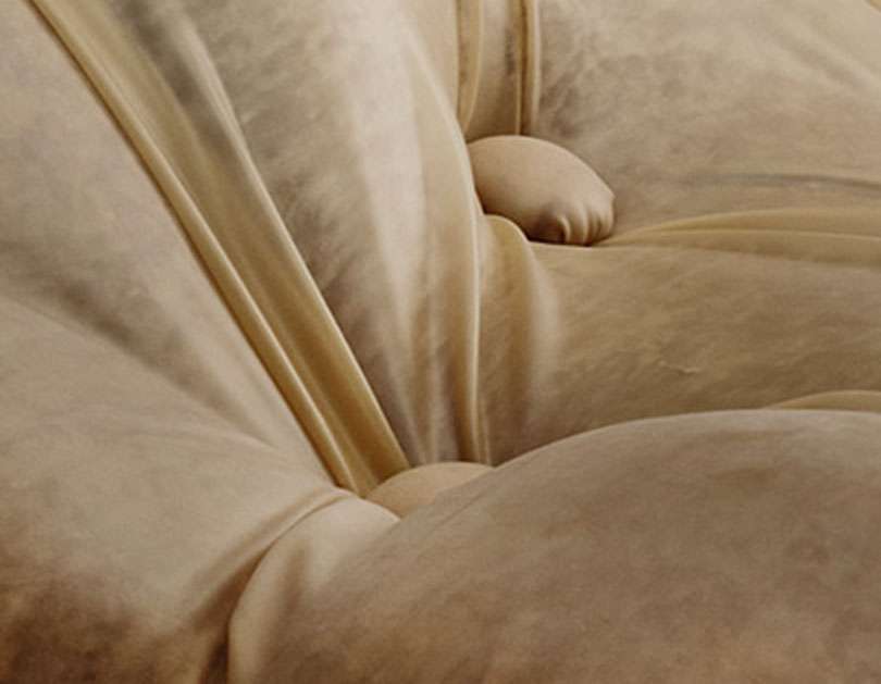
Personally, I'm captivated with Kingsnorth's use of material— the chair is upholstered in pink velvet and covered in latex sheeting, tufted in bulbous, irregular protrusions. I've posted one of Saville's paintings just underneath, and you can really see how well the velvet/latex combo replicates the soft, mottled quality of Saville's paint. Viscerally disgusting? Yeah, definitely. But I'm intrigued.

Above, At One by Charlotte Kingsnorth, 2009.
From a Dezeen article on the piece:
"At One is a sofa which has been devoured by its obese occupier,” says Kingsnorth. “It tells a story of a relationship between a person and their sofa and the evolution of their bond through time spent sitting together.
Above, Prop (1992) by Jenny Saville


9 comments:
How interesting, I have long been a fan of Jenny Saville, You are right the chair is both repellent and compelling at the same time
Wow, first time here but after looking through the whole blog, I can't remember how I got linked. The chair is creepy and mesmerising. It didn't remind me of fat people on thin chairs at first but of this horror movie/photo/something I saw once where the victims are skinned and their full body/skin suit are left to dry and on a rack.
The close up makes me want to reach out and touch the "skin" just to see how it feels like.
I'd feel awkward sitting in that chair
Interesting... I like the chair as a piece of art, but it would be banned from my home! Somehow it creeps me out a little.
I love that you made this perfect connection. Interesting concept, but how about aesthetics? Hmm. I think the latex is making it creepier than it is. Like a hospital room gone wrong.
Great comparison! Can't you see those chairs in a gallery with her paintings!
I think it looks like a decapitated Miss Piggy laid out to dry. And I liked Miss Piggy!
I need to go on a diet...
the darkened foot portion of the sofa was bothering me. wasn't sure why until i scrolled down and saw the painting.
brilliant! absolutely brilliant comparison. we bring so much of our own perspectives, preferences and life experiences into what we see and how we interpret things....
Post a Comment