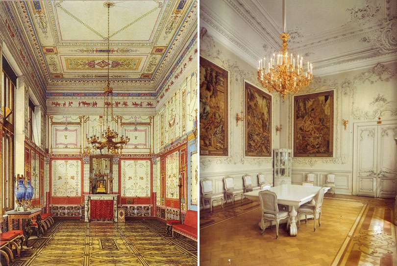
The small dining room in the Winter Palace of Czar Nicholas II and Empress Alexandra, before (left) and after (right) Alexandra's dramatic redecoration in 1894/95.
Formerly known as the "Pompeian Dining Room," Alexandra obliterated the Pompeian ornamentation, gutted the intricate inlaid floors, added Rococo moldings, tapestries, and painted the entire room WHITE. At the time, Empress Alexandra was heavily criticized for her taste and the royal court was horrified that she would stoop so low to purchase her furniture mail order from Maples of London.
Clearly, it was an epic overhaul. Less clear: Was it a mistake?


8 comments:
Lord God yes!(and she was a religious woman) How could she commit such a sin. Sacrilege! No wonder the Czar went by the wayside. Quelle horreur. Perhaps some of Victoria coming out in her. I could go on-but such a tragic ending.G
call me crazy -but i love each room, as they're completely different and hard to compare!
I can see how at the time, this all white room was a dramatic departure from anything being done, particularly in Russia - I can imagine the outcry! SO modern, so elegant! The pompeian room is pure drama while the white 'french rococo' room is pure style.
from a decorative art appraisers point of view, yes. from an aesthetic point of view... my god, i think her all-white choice is gorgeous!
an 1894 makeover! how compelling. How little we have changed, we are still ripping down the curtains and painting rooms white. x
Yes, a huge mistake. It looks like what someone would do in one of these new tacky mcmansions.
While both rooms are ab-so-freaking-lutely stunning, I have to admit my heart beats a little faster for the original. I just feel like the other one could be found in any old amazing castle, but the first one screams Russia to me. Plus, I imagine it would be more fun to be in, I'm a sucker for intricate details and pattern.
I agree that before is better, for me. I like all of the color and pattern and what the hell is that austrian shade doing over the fireplace? I've never seen this before, have you? Hmmm, maybe something like this will come home to roost in your fabric covered mantle!
First one is absolutely better, the second one, and i mean this as an insult, looks american. By that i mean it's just a heaping together of different things that are nice by themselves, it's both unimaginative and historically incorrect... it isn't, like the best beaux arts examples, an improvement on the style it copies or an interesting paraphrase of it, it's just clumsy imitation disregarding some of the rococo's fundamental qualities, not clean enough in it's whiteness to adequately bring out the details of the relief but just clean enough to be boring.
Besides, i'm quite sure there was allready a much more interesting neo rococo dining room in the winter-palace, that had some of those beaux arts qualities of improvement so it certainly wasn't that much of a novelty when constructed.
Post a Comment