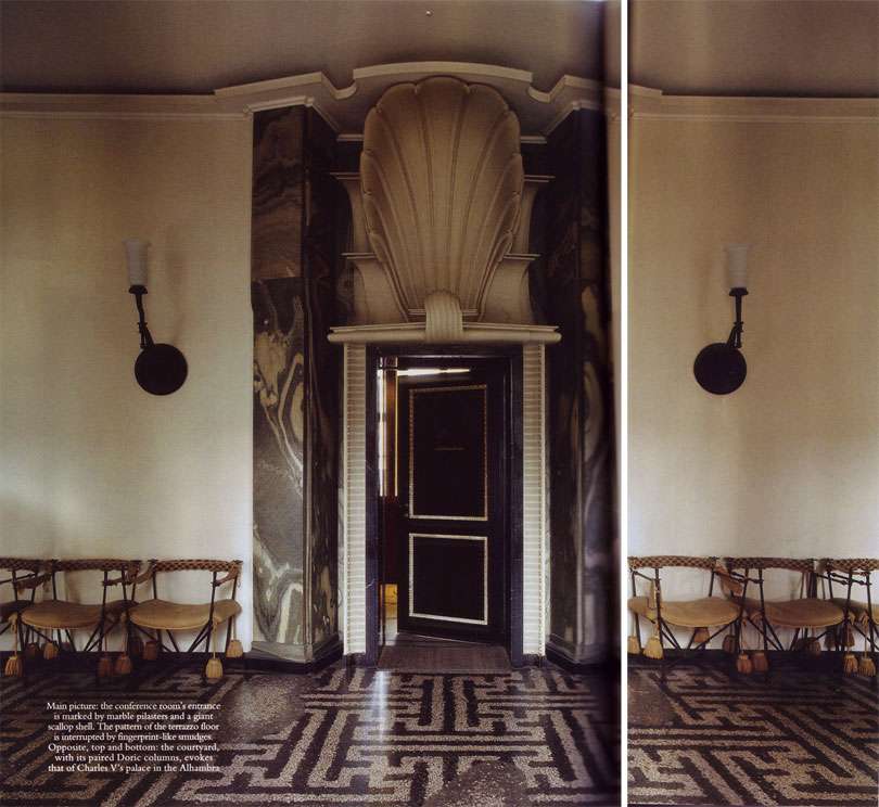
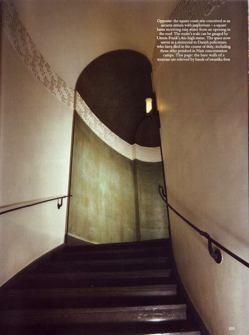
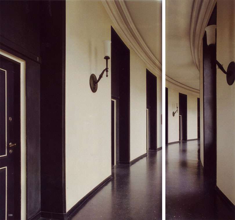
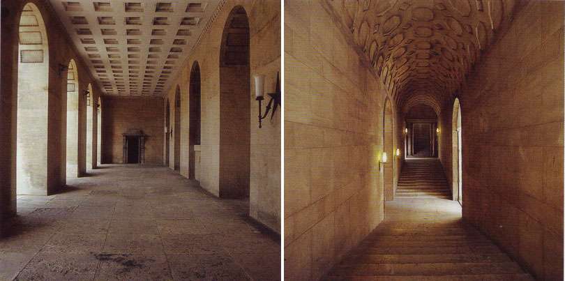
Built in the 20s, it strikes me as a bizarrely wonderful twist on neoclassicism. For example: check out the "fingerprint" smudges on the floor. I'm also infatuated with the larger than life shell, marble pilasters, chairs with giant tassels, velvety green paint...
All scans from World of Interiors, January 2010, "Arresting Offices." Photography: James Mortimer.


6 comments:
Wow. What a unique space! The curving hallway with the black doors is strikingly graphic.
I've been loving your blog by the way. Such a cool mix of all things aesthetic. Just linked to you. : )
- Catherine at Littlehouse of Style
http://littlehouseofstyle.blogspot.com/
Are you kidding? Police headquarters? It looks like a palace!
Oh me oh my! How lovely! That olive green distressed wall in the second image- you know I love a good wall! We need to get out of the U - S of A
I feel like a Kafka character should be walking down the white and black hallway.
Absolutely sensational! Why can't they put that kind of style into today's municipal and civic buildings? And look how wonderfully it's held up. Today's post was a real treat. Thank you.
I've been a very bad girl as well!
Post a Comment